Behind the print: “Blue Lake - Rockies"
- lucy w
- Mar 13
- 4 min read
Laura Reiter shows us how she made her gorgeous new Rockies screenprint and gives an insight into how she develops her artistic ideas to create vibrant, atmospheric images.

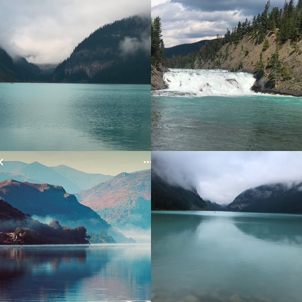
I went on a coach tour of the Rocky Mountains in Canada last year, travelling from Calgary to Vancouver and Vancouver Island. The views along the way were spectacular and varied. The forest fires were just beginning to die out, but we could still see the smoke rising in the distance as the fires subsided. As well as seeing trees, mountains, and city life when we got to Vancouver, there were many absolutely stunning lakes. The water is a beautiful blue colour due to the fact that rock dust produced by the friction between bed rock and massive glaciers is suspended in the water, reflecting light and creating the turquoise colours.
I take a lot of photos and use them as reference and to bring back memories of the places I visited. Once I am back in the studio, I can create my prints and paintings. Sometimes I will also do mixed media paintings, one of which you can see below.
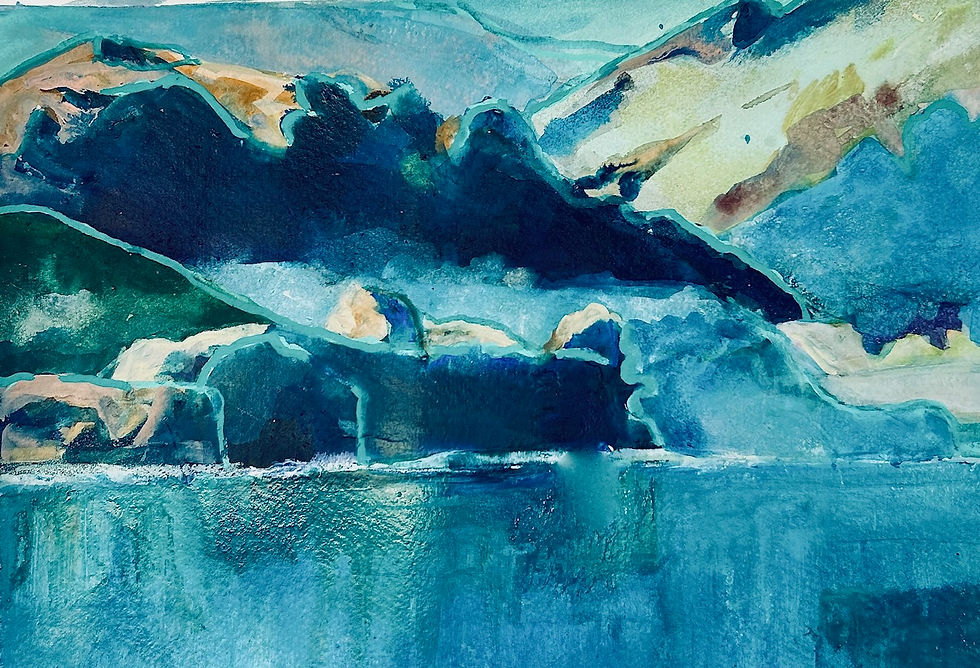
My overriding memory of visiting this place is the incredible colours of the lake, which were a beautiful, almost unreal, icy blue. The other memory is that even though there were many people around, there was a feeling of total calm and tranquility. There was an almost surreal quality, and above all, I wanted to try to create that feeling in my screenprint.
Starting to print
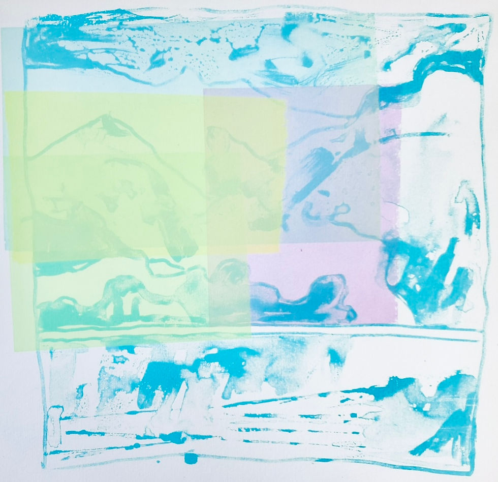
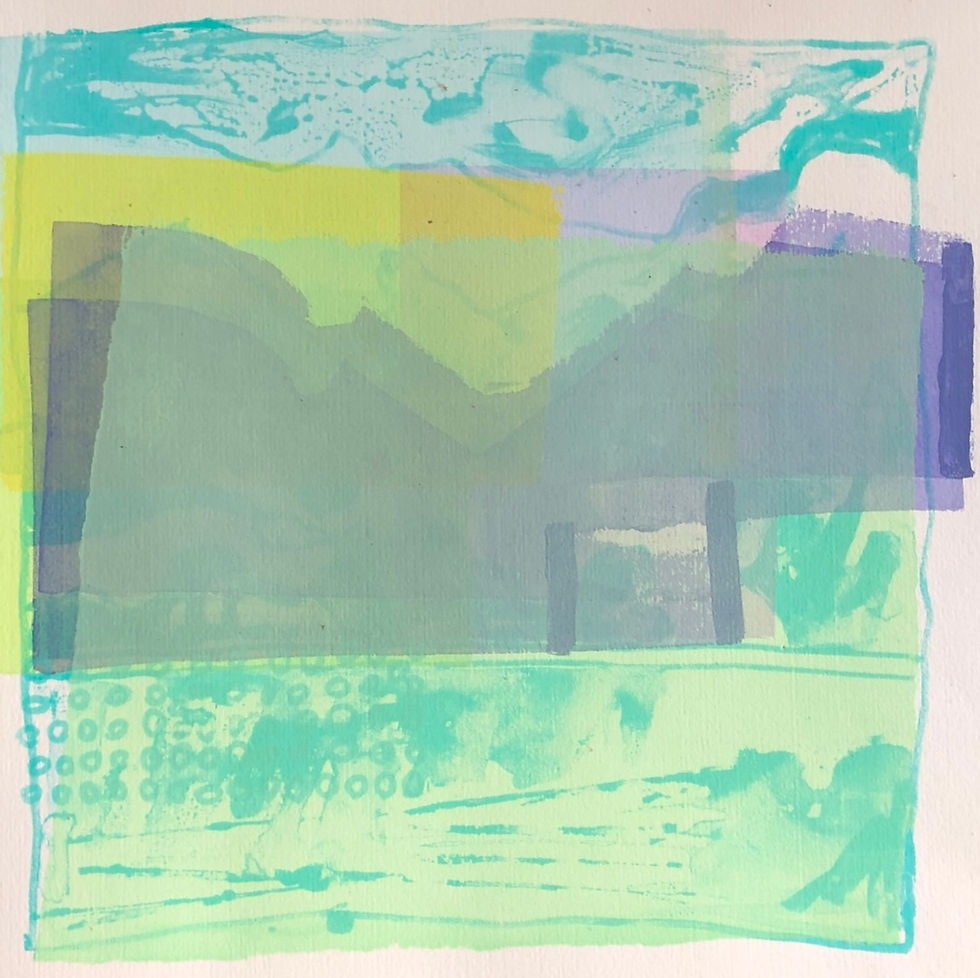
I don’t generally know, or want to know, what the finished piece will look like before I start as I prefer to let it grow organically, responding to each last step I have made. For this print, I have started with a light blue linear drawn design. My plan was to work in transparent layers to build the image. I felt this was a good way to get that feeling of tranquility and allow the image to slowly reveal itself.

The next step was to print with very transparent colours, one over the other, to create a set of ‘veils’ to try to portray an air of misty mystery and to begin to get a sense of distance and the overall design.
I decided to find a few more shapes, such as the mountain shapes on the shores of the lake, using a transparent purple, which also neutralised the colours underneath and created a slightly darker tone.
I was also trying out shapes on the right-hand side and added a few lines of decorative small bubble shapes on the left where the reflections in the water are. I love patterns, both as description and as decorative elements, and often use it in my work. Sometimes they are there to describe a particular element and other times just because they enhance the image. Circles are one of my favourites!
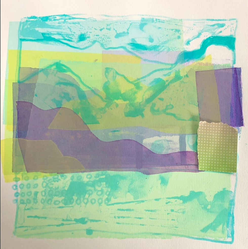
Having built up a few layers, the next stage was to start to carve out the composition. I like the idea of using transparent white to hide areas so that they are almost there but not there. I printed a large transparent rectangle over the top two thirds of the image, separating the mountains from the water, and having done that I reprinted the transparent purple mountain shape very lightly again, plus a transparent purple rectangle (near top right) which not only printed as purple but also neutralised some yellow into a light brown. The blue original outline of the mountains create a sense of place, and some water ‘wiggles’ add some more information to the scene in the foreground.
I sometimes like to put some finishing touches by hand-drawing with an acrylic pen, and so the opaque pink lines and circles were added.
I chose the pink as it did two things. It is within the colour range of the purple of the mountains, so consolidating them, and at the same time, it is opposite to the greens and greeny\blues in the other parts of the image. The pink lines sit on the surface of the print, creating another shallow space on the picture plane.
And here is the final image. I hope I have created the kind of image I set out to make – one of a rather ethereal, quiet and peaceful place.
You can see lots of Laura's wonderful prints in our Greenwich Printmakers gallery in Greenwich Market all year round, and our online shop has a small selection of her work. For more information, visit her artist's page or her website.
Kommentare